Showing posts with label canadian photography. Show all posts

Thursday, January 9, 2014

More Imagination Please...

Out of the Blue

If you haven't been to my Facebook page recently, you might wonder why I'm posting satellite images from space...

Where Two Worlds Meet

Cool images right? The roiling frozen ocean in the first one. A distant deserted valley colliding with a body of water in the image directly above. Dry and hilly terrain flanking two distinct roads in the photo below.

Paths Divided

Wow, Christine... when did you have time to fly to the space station? 

Those of you who have been on my Facebook page in the last 24 hours know exactly what you're looking at... the rest of you aren't sure but you're pretty certain that in between my last blog post and today's that I did NOT take up space travel. You can click on each image to see it enhanced. What you see is an abstract study of frost on a window and this photographer got excited about it. When was the last time my imagination soared? How about yours?

Whatever you see in those images right now is why this is so fun and so rewarding by the way. Three minutes ago you were contemplating how to start your day, or how spend your next break at work, or if you really want to fold another basket of laundry, and within the first minute of perusing the blog you suddenly had your imagination engaged... and as imagination is usually apt to do, you were transported with very little coaxing.

I've been asked before about the point of abstract art by folks who "just don't get it". To which I always answer with another question: Well, what's the point of imagination?" The answer I get ranges from 'it let's you explore life unhindered, free of stress, open to magical possibilities' to 'it's what lets the giant box the refrigerator came in turn into the invisible plane you fly as a superhero!'... 

Both answers are correct. And that's Abstract art too. For the viewer, it can be whatever you want it to be. Or you can use your imagination to gage what the artist's intent was... and you might get it right, or you might not care if you do at all... what matters is if it stopped you even for a moment and made you mull the possibilities over, got your imagination going, musing, or transported you elsewhere. And do you walk away slightly altered... ?

And for the creatives, for the artists, abstract is the chance to take what you love about compositions, and the power of shapes, lines, and colours, or the lack thereof, not to mention the medium itself, and infuse it with whatever strikes your fancy. It can romp, it can be expressive, it can be purely aesthetic, a puzzle to be solved,  or it can have important concepts needing to be conveyed. 

Or it can just be some everyday winter frost on a window pane photographed out of context. Personally I say let the 5 year old superhero out, and wreak havoc. Your art will thank you every time.

And all our 5 year old selves chant, "MORE IMAGINATION PLEASE!!!"


Wednesday, July 17, 2013

When You've Got The Blues

"Quiet Dusk"

Dusk. Things quiet down. Bird song is amplified. Music carries from the distant pier. The water barely moves. We walk the trail by the local marina and here and there a couple sits on benches overlooking the restful scenery, letting the calm do the talking. I let it call to my camera on this particular night.

Why haven't I used this wonderful low light more often?

We see in colour, we see in black & white, but I have struggled with seeing in 'blues' I'll confess. There are only subtle, gradual changes from highlight to shadow. From one tone to another to distinguish shape and line. If anything, the blues of dusk cause me to really pay attention to the light, where it plays, where it disappears, what and how it illuminates and not as much on good composition to also carry a story.

When you've got the blues that come with dusk's final light, you are forced to sacrifice blatant contrast for more subtle details, in order to preserve mood and perception. And in processing, you have personal considerations galore. Do I remain true to the colour cast? Do I only accentuate the light skimming over the objects in the foreground? Across the water?

I decide it's not necessary to see every bold detail on the boats, we know they are there and that's enough for the image. I decide I love how the light grew intense near the sun's connection to the horizon and keep that intensity. I keep the composition consistent with the lily pads mimicking the clouds above.

When all is said and done, how lovely and quiet the evening was comes rushing back to me. You'll all see something different, which is just as wonderful. It's what I love about the arts period.

Have a great week, and thanks for this ramble in the dusk.

Tuesday, July 9, 2013

Tall Ships and Opportunities Abound

"Sorlandet in Sunset"

One of our long weekends just past, the family and I wandered down to the waterfront to enjoy the Tall Ships event happening in the Hamilton Harbor. The weather was a perfect summer temp, so the entire Pier and beyond was swarming with people there to enjoy the festival. The tall ships don't dock here every year, so the crowds were thick. As were the number of cameras visible. You knew the local photo communities were about to be flooded with sea faring vessels photographed at dock.

Limited access was the order of the day... many ships roped off for special sailings and tours, others simply docked near food and displays... and throngs of people. It quickly occurred to me that there were only so many places and views and vantage points to be had. And that all weekend hundreds of other photographers would use them all as well. But I didn't let that deter me from getting my own photographs of these carefully restored and historical beauties. And sure, I could have returned with dozens of others in the early morning hours in the dawn, to try to get something different and unpopulated but I was also enjoying some added family time.

I guess I'm posting all this to say that I no longer valiantly try to get "the" shot when I'm out on a ramble... one that no one can compare another to... I think over the last little while I've figured out that I'm always happy documenting what my own eye and camera actually see, or interpret, around me. If I'm experiencing something similar to someone else shooting nearby, so be it. Another photographer I know showed up, saw how limited it all was and decided it wasn't worth it. But why not? Why not enjoy what you see? What speaks to you personally is just that, personal. And if it's personal, you would hope there would also be something unique about it anyway.

So many are obsessed with the "it" shot that no one else can get. But the world isn't exactly getting any bigger. Just the opposite. You are going to ramble and explore and get the same scenes or subjects someone else might have had at some point. Does that mean you pack the Nikon away and pick a new career or hobby? For me that day, it meant noticing the way the sun shot beams through the Norwegian Sorlandet's rigging across from where I happened to pause with my daughter. I took a minute to drink in how pretty it was. It meant if I waited in that exact spot, I could compose for a nearby ship to sail into the frame as well, under a golden sky. Getting the image was a creative and personal experience. And after some slight editing, I can say that this photograph is completely unique to me personally, which is the most rewarding feeling to come away with anyway.

In a world overflowing daily with more and more photographers trying to outdo one another, fabulous images will abound on a more personal level. Don't let anything rob you of that.

Thanks for the prodigal ramble, gang! It's been a while I know. 
Have a good one.

Monday, April 22, 2013

Happy Earth Day!

"Nesting"

A late post for today, but I finally had time to work on some photographs of our local mama Swan. She's laid one egg, and is watching over it and tending to it carefully everyday. In much the same way we should be tending to and watching over the only world we have. Appropriate for Earth Day, don't you think?
I did everything in my power to ensure she still felt safe with my presence nearby... so the trusty telephoto zoom came in handy. I hope you enjoy. I'll return often, no idea when the tiny cygnet will hatch!

"Nesting II"


"Details in Nature"


"Mama and the Egg"

Happy Rambling on this special day, gang! Get out there and enjoy nature today, and perhaps say a prayer of thanks for all we have.

Friday, February 22, 2013

A Natural Progression ~ My Creative Process

Cowboy Boots Study #1

A week or so ago, I noticed my husband's boots sitting out near the back door. I've been chiding myself on neglecting my camera lately. So I grabbed the boots and started looking for some nice light to photograph them in. It'd been a while since I'd done any sort of still life photography, and something was waking up inside me.

Today I'd like to post the resulting images, in the order of how my creative process worked, so you can see how I got from the beginning image above, to the final image that felt right, and why. Not EVERY shoot goes exactly like this, but this is my general process. And it's not methodical tedious thinking per se, it's a natural process that happens while I find the light and composition I feel melds with my intent. There's a rhythm and a flow.

Study #1: The most interesting light (above) was happening from the southwest, very late in the afternoon, shining in on our stairway. I don't like images that look too staged, so I plunked the boots down in a way that looked like they'd been left there. I wasn't sure how I wanted to use the stairs at all, and when I begin to explore a subject I pop my wide angle zoom on first, allowing me to photograph certain elements in the scene all at once and decide what I'm continually drawn to.

Cowboy Boots Study #2

The #2 shot (above) is actually much better than my first for a few reasons. I moved from eye level to shooting across the stairs and slightly below. Rarely do I stay at eye level for anything. The light shifted slightly at this point too, giving some definitive shadows and highlights. And including more of the surroundings actually helped this perspective, while showing off the light. It started to occur to me that the wear and tear on these 22 yr. old boots was a way to express my intent when lit with low side light.

Shot #3 below became a switch for a couple of reasons. I was still looking for a more interesting way to frame these while the warm light was hitting them. I liked the worn spots on the stairs and thought to play that against the wear on the boots in that light. Plus, at some point, I ditch the wide angle, and grab a lens that will bring me closer to the subject. I grabbed my F1.4 50mm prime lens instead, and getting aggressive with my point of view, I placed myself above the boots on the stairs. I also changed the placement of the boots, using them to pull you into the frame naturally to the right. But somewhere in a series of shots taken of this version of the composition, I realized I loved the details on the boots more than anything, and that the deep interior of the boots from above pulled the eye away from those same details.

Cowboy Boots Study #3

Which brings us to the final image. The shot that shows my intent. The shot the emphasizes those rugged details, that leaves nothing unnecessary in the frame, that even propelled my decision making process in the digital darkroom. I got low, I got close, I used a shallow aperture, I waited till the light would bounce off the back of the stairs and skim the wrinkles and lines of the boots. I made a decision to point the detailed toes of the boots into the camera lens which seemed natural to me. And in post, I overlayed a very subtle and warm sepia-type preset I'd created for myself, enhancing the used look of the old boots. It's my favorite image from my self-imposed exercise. 

"These Boots" Study #4

There's just a glimpse into how my head works as I photograph. It's my creative process. Some of it is born out of adapting to the light changing, some of it to how a composition feels, and some of it's born out of how the whole package speaks to me. It's the work flow of a shoot. A natural progression, and very abstract in many ways. For those that have wondered how this all progresses for me, I hope this helps. (You can click on any image to see it enlarged and of better quality.)

What's your creative process? It's something every artist should be aware of. Have a good one, and thanks for the longer than normal ramble.

Monday, December 3, 2012

Use That Flat Light!

 "Sheltered"
Ball's Falls Conservation Area, Grimsby, Ontario

We're told there's several things we need to avoid to achieve better photographs. Don't crowd a photo with too much info. Don't put your subject directly in the center of the photo. And avoid flat, grey light. But as with every general principle or guideline, there are always times to use the very things we try to avoid. 

 "Welcome to the Garden"
Ball's Falls Conservation Area, Grimsby, Ontario

Take the images from today's post. They were all taken during flat lighting conditions. And thank goodness. In solid cloud cover, colours in nature stay true due to little or no reflection from the sun, they seem additionally saturated, and deep shadow was never a concern, allowing me to make a correct exposure and worry more about composition and vision, especially in the first image of the close up of the driftwood.

"Doorway to Yesterday"
Ball's Falls Conservation Area, Grimsby, Ontario

I'm wary of only ever shooting in ideal conditions, you should be able to capture the magic, or a story,or the vision no matter what conditions are out there. I challenge you to see what happens when the wrong conditions are the right ones... start with using that flat light as a tool in your photo arsenal!
Feel free to click on each low res image to view the larger version, and thanks for the Ramble folks! Have a good one!

Friday, June 29, 2012

Oh Canada!

"Canadian Pride"

Well it's been busy days around here lately, and I've neglected the blog in the midst of the chaos. But here we are approaching the Canadian long weekend, prepping for Canada Day on July 1st and I wanted to post an old favorite out of my files to celebrate.

Can I share a dream with you? One day, it's my hope to travel across the country in one giant back roads road trip. And take my time, finding small details like this one above, to photograph. Hidden gems in the rural and the urban.... without ever taking a short cut on the highways and freeways. I don't know if it will ever happen but our country was built on the dreams of people who had a heart to explore. And I know I'd get the chance to meet photographers from one end of this beautiful land to the other as well. I think that would be extremely exciting.

It'll be something to plan for when the kids are grown, and the hubby has less responsibilities... for I now I keep dreaming.

To my fellow Canadian photogs and beyond... Happy Canada Day weekend and keep your dreams alive!


Monday, February 6, 2012

Getting Inspiration!

"When I Think of You..."

I needed to start my week inspired. It's as simple as that. Where do you find your inspiration or motivation to jump into that vocation you love, no holds barred as they say? Books? Galleries? Your neighborhood?

I gain inspiration all those places too of course. But when I need an instant boost to the creative juices, I turn to some of my favorite bloggers and photographers. And I thought, why not share them with you! These go beyond just photography for photography's sake. These never cease to make me sit up and say to myself, "Self... when was the last time YOU shot with that kind of obvious passion?"

So here are the go-to sites I choose specifically when I need to be inspired:


I poked through all of them today, and what do you know? I feel fired up and ready to photograph and explore in a way only I know how! That's how inspiration works. Find the one thing that will get you excited about your tasks today, and let's all get crackin'....

Happy Monday gang!

Wednesday, July 6, 2011

Knowing Your Tools ~ Wide Angle Wednesday!

"Lost and Found"

Who here loves to learn? I certainly do. Had a random conversation one day with several other photographers who have begun repeating a sentiment I'm hearing a lot lately. And it goes a lot like this - who needs workshops, teachers, and programs? Just get out there and shoot already.....

I get told this every time I mention a workshop I'd love to travel to, or a webinar I feel the urge to promote to others. People look at me like I'm insane and always state "you're there already, who needs to waste time on something like THAT?" And to a point, in order to discover who you are as a photographer you DO have to just pick up your camera everyday and pursue photography your own way, with your passion, and no one elses. I hear that.

 But.... I personally believe in fully knowing the tools I have at my disposal as well. And I mean KNOWING my tools, understanding what I can accomplish with what I have, and maybe what my needs will be in the future as I grow. My husband can tell you that. Tools are what get you the final result. I shot the interior of the garage this morning for my motivation challenge. He had tools laying everywhere, ready to build something. He knows exactly how to use them all to his advantage, but he had to learn about them first. And I can honestly say I still don't know everything about my own tools of photography, and never will. And if there are ways out there to learn more, and things that will show me to be better with my camera, my lenses, my business, my vision then I'm sorry, but I'll be taking it all in. Why do some folks make it seem like being taught means lowering ourselves? Now yes, some workshops are designed to take your hard earned money and try to distract you with new shiny things so it seems as if you made a great investment in learning... but not every opportunity is built that way, and not everyone is out there to con you. You just have to wisely do your homework.

I never have a ton of money for the big traveling workshops anyways, but if I did, I would find one that combined a dream come true location with talented seasoned instructors. And of the smaller and more inexpensive seminars and teaching webinars I've signed up for, I've come away with more knowledge about photography than I had going in.

Things like A) knowing your reciprocals saves your work at a shoot happening in constantly changing light when your meter swings back and forth on you,
B) knowing how to read a histogram properly so that every shot has skin tones looking amazing, C) finding out that every time you add a flash you double your Fstop, and D) that your website and your blog need to be cohesive, yet fill different needs at the same time.
All these things were things I didn't know, till someone more in the know told me. And they've improved my photography because of it.

Don't let anyone tell you you're past learning. Devour information coming your way... then instead of sitting on it, grab your camera, call your web designer, or whatever it is you just figured out you need to improve your approach to photography and get out there and prove you can do it!

Thanks for the preachy little ramble folks! Feel free to sign in and leave a comment too. And have a super day.


Monday, June 27, 2011

Fiddler's Delight ~ Mono Monday

"Fiddlers Lullaby"

This is a bit unusual for me, but today's Mono post is a little more rich in tones than most... but still monochromatic so no worries. This is another shot from the series I took while learning more about using my flash off camera. Back when I had free time. But I digress.

Sepia effects aren't my all time favorite type of monochromatic conversion, but sometimes the subject dictates how you edit. And whether it's not my favorite use of converting to mono or not, the warm tones of the sepia really bring life to this image more than any B&W conversion would. Simply put, it suits. What I love about sepia is that it starts with such a flat effect, but put her through curves in editing, add some clarify filter at 4%, and finish it with Nik's Skylight Filter which makes highlights sing, and hues and tones brighten even just at 25% on the slider... and you have the perfect portrait of the ol' girl. At least that's my humble opinion.

Sepia certainly has it's uses... when I first started out in photography the trend was toward overusing it on everything, much like the HDR trend of today but I'll not get started on that rant... yet. But your digital darkroom allows sepia to really make a statement these days. Oh, and P.S.... if your camera lets you switch to sepia while taking the picture, avoid this and do it later in processing. Then you have all the control instead of your camera making choices for you. But again, I digress.

Sepia. Not my ultimate favorite way to edit, but beautiful none the less given the right subject.

Thanks for the ramble folks! And hey, only 2 more days to vote for this blog at Circle of Moms (the big pink button is over at the side, please click to vote!) and then we'll see where we land when the dust settles! Thanks to all of you who have been voting so faithfully... you're the best cheerleaders a gal could have!

Thursday, June 16, 2011

A Bloggy Break ~ Exploration Thursday!

"Poetic Profusion"

Here I am in the middle of my biggest editing week so far. It's been good but it's been busy. And next week will be much of the same. I've realized that I appreciate being able to blog more so during my crazy weeks than any other time. Why? Because for a few moments I can do something completely different from my work editing (which I still find exciting don't get me wrong) and just interpret a more personal photo my way. It's my equivalent of getting up and stretching for a moment at the computer in the middle of the work day. Some of us head over to the water cooler, I head into my personal photo files and take a deep breath... ahhhhh.

So here's a peony shot I took last weekend on a much needed break. I played with this in Corel... made a few layers and got some different soft colors, perfect for this flower. I duplicated the original layer in full color and converted it to sepia. Added a contrasting adjustment layer to it so to make the creamy areas pop slightly. But then I played with it's opacity a bit to remove any shadowy tones that were too heavy for this shot. Some slight pink was starting to show through from the color version underneath.

I unlocked the original layer underneath, then when back to the sepia layer and with my eraser tool I began to reveal certain individual petals from underneath that had nice color and could make the overall image include some depth. This wasn't as time consuming as you may think, and again, it was nice to just play without the pressure to please anyone but myself.

I liked the final result immensely and it was just the break I needed. I hope to be able to show you a shot or two from one of my sessions next week so you can see what I've been so busy working on for the last two weeks, but until then I'll get my fill of peonies!

How do the rest of you photogers relax from photography work? Switch to personal projects? Hide the camera away and have movie marathons? Take the family for a hike? Whatever it is, it usually feels good no matter how much you love your job. Glad to know we're all the same!

Thanks for the ramble folks! Have a wonderful and blessed Thursday.

Monday, June 13, 2011

Peony Love ~ Mono Monday!

"She Loves Me, She Loves Me Not"
(1/200 sec.@ F7.1, 180mm fl, ISO 160, 55-200mm Nikkor telephoto VR, shade)

I love love love peonies. Love them. Every aspect of them. Their scent is what heaven will smell like, I'm sure of it. That's heaven wafting through my window and across my work station right now. Their shape, their delicate profusion of petals like all the ruffles on a lady's skirt. Their sweet subtle colors. Out of everything God created for us to enjoy, I think the Peony is His most beautiful and poetic. Did I mention I LOVE peonies?

They're in full bloom right now in my garden which means I make time each day to run out there with my camera in different light and weather to get tons of pics. And I promise I'll try not to smother you in peonies all week... but hey, I'm prone to be a little less motivated to keep promises of that nature right now when they all look so darn delightful!

Mono Monday, so I have taken one of the close-ups I got this weekend and converted it. But a straight conversion didn`t yield the nuances of each petal the way the color version did, so some layers work occurred. After creating a duplicate layer of my initial conversion to the platinum B&W in PSPx2, I made sure I took the original layer into the adjustments menu and really brightened the overall image, more than usually necessary. Then in the duplicate layer I applied the B&W to the Curves option, taking the highlight and shadow points to areas where they made both extremes pop. The duplicate layer`s opacity was opened up slightly and then I proceeded to use the eraser tool to reveal the really bright layer underneath only in areas where there were natural highlights on the edges and topsides of petals. The image began to take on a depth it needed from the original conversion into B&W. A little time consuming, and required some vision as to what I really wanted to be important to this conversion. Am thinking already that I need to do this again in a really true B&W option now, that I may like it even slightly starker than it is now.

And that`s okay. Some images evolve. Your vision for an image will evolve, change, improve, become riskier. It`s called art. And more than peonies, I love art. What do you love? And have you pursued expressing it lately? Or taken the risk to show it to the world? ....More peonies anyone?

Thanks for the ramble! It`s an editing week for me, so except for the blog I may be off the grid for a bit... so have a fabulous Monday! Oh, and shameless plug here - please be sure you click on the pink vote button on the right side of the blog for Circle of Moms to place my photography in the Top 25 Photog Moms! You can vote daily! Thanks!

Friday, June 10, 2011

B&W Beauty ~ Floral Friday!

"Simple Grace"

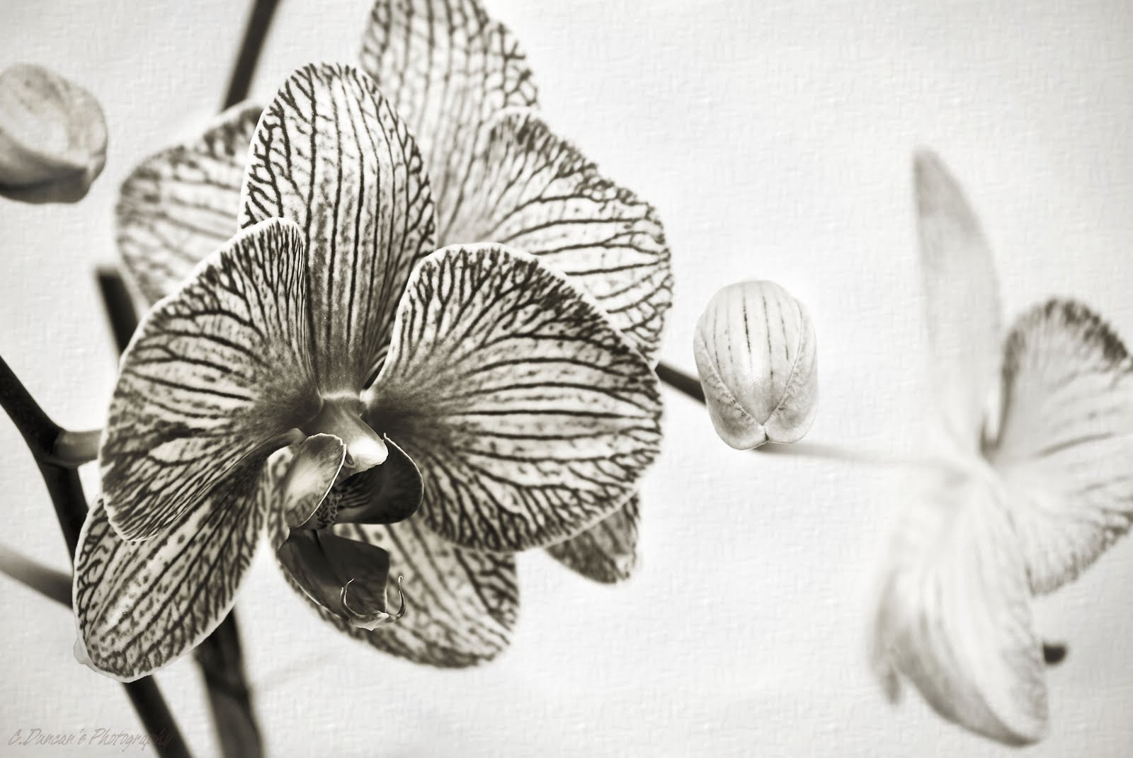
Well, I did promise Floral Friday here at the blog and deviated from the Doors Open theme. But thought I'd stay with my theme of B&W that I kept with also through the week. I'll be curious to see what your thoughts on this are. When I thought about the perfect flower to convert into mono tones, orchids came to mind... unique shapes, great veins of texture, and a bit of a compositional challenge when you lack a macro lens to fill the frame with.

The Platinum fx filter in Corel is lovely to work with, or at least, it's become one of my personal faves. When you take it into the curves function in PSPx3, you can fine tune every tone, every shadow, every highlight with a nice depth that is a little less stark than a classic B&W option. Perfect for floral shots. But that's just me. Every artist has their own approach. In a separate layer I added a bit of subtle texture, and with an eraser tool erased most of the clean background revealing the canvas effect underneath, leaving the flowers for sharpness. I merged the layers when I decided I had achieved the right opacity. Otherwise, the background was too bright for the image.

I shot this in my kitchen actually. I was playing with window light, a cheap white sheet stretched across the window acting as a diffuser, and my telephoto to get in close to the orchid in the foreground, blowing out the backdrop slightly and using a larger aperture so that I could get a much shallower depth of field artistically.

Enjoy today's image folks, and thanks for the ramble! Have a fabulous weekend and please remember to click on the Circle of Moms badge on the right hand side of my blog page if you've been enjoying my photographs! Thanks everyone who has already voted!

Wednesday, June 1, 2011

Queens Park ~ Wide Angle Wednesday

"Light From On High"
(1/25 sec.@ F/3.5, ISO 640, 18mm fl, low light diffused, handheld)

Another post from the Doors Open TO Event. This is the Victorian style lightwell that shines down on the east wing of the Ontario Legislative Building at Queens Park. It was beautiful. It was regal. It was the only light source that made it possible to photograph the cavernous space full of tourists and photographers on Sunday. I'll say this for the rest of my life... interiors are very tricky.

Tripods were not allowed, and I cringed as I took each shot because with the surging crowds of visitors I had no chance to balance the camera on something like my kit bag or a railing to use a lower ISO and slower shutter speed, and no offence Nikon, but unless you're using a more expensive body, Nikon's higher ISO's (starting at 250) become very noisy/grainy. And the more I have to fix that in PSP, the less detailed it becomes. And that's working in Raw. Guess I'll see how she prints.

Knowing that my high ISO was going to cost me, I chose subjects that were fairly architectural with nice perspectives and interesting light. And in areas where I could lean against a pillar or railing for a few seconds to steady my shots since I had to be tripod-less. And I'm sure there's tons of similar shots being posted to flickr and such right this second, but I still needed to try my own approach to this anyways. If you don't shoot, you don't learn, and you don't improve. And trust me, I still have so much to improve!

Thanks for the ramble today folks! Hope you're all improving your craft too!
Have a super day gang! See you all tomorrow!

Thursday, May 26, 2011

Limitless ~ Exploration Thursday!

"Locked In"
(1/320 sec.@ F7.1, ISO 250, 100mm fl, 55-200mm zoom vr, bright morning sun)

I love photographing the city. I've said that before. So when the chance came this week to head out with the camera I made a decision to leave my wide angle in the kit, and only use my telephoto. No matter what. Why? Because limiting myself to one lens forces me to look at things differently. That limitation brought me limitless opportunities to be creative. It was energizing!

My wide angle is my go-to lens for so many subjects and scenes, that I sometimes forget I have other lenses in my bag. I get comfy. Or perhaps more accurate is that I get lazy. So once in a while, to break out of the routine I keep placing myself in, I try exercises like this one. I either limit myself to a type of gear, or I limit myself to a central theme. I should know never to be surprised at how fun and varied the results are.

The shot above had all the things I like in a details shot. Rusty, weathered iron gates across a defunct storefront. A big ol' lock that would never turn now for a key, and difficult light adding to the urban decay feel. I pumped the color cast a bit in Nik Effx plug-in Brilliance/Warmth while in PSPx2. Then it was done. And I'm pretty pumped about the other gems I'll have for the coming weeks too.

Put a limit on how you shoot, and force yourself to think more creatively. The possibilities for great shots that express how you see things around you are limitless!

Wednesday, May 25, 2011

Closing In... Part 2 ~ Wide Angle Wednesday

"From the Earth to Your Table"

Picking up where we left off yesterday... composition matters. Walker Evans was quoted as saying, "Shoot whatever and however you want. Don't listen to anybody else, just go in the direction you've chosen. But you need to look before you see!" How are you choosing to look for subject matter? Are you limiting yourself? Or coming away with images that feel like they contain everything but the kitchen sink?

In the past when I've felt like this, and don't know what to work on fixing first, I've gone back to the Elements and Principles of Design and tried to pick one that seems to be lacking from my images overall. Then I go out on a shoot with that foremost in my mind as I look for a scene or subject that will help me define it. It sounds methodical but it gets the creative juices flowing and helps you target elements so that you naturally start to recognize them over time. And you start to think outside the box.

Today's image isn't a phenomenal work of art by any one's standards, but it helps me close in on the other elements and principles I couldn't cover yesterday without my brain exploding! That, and I like purple. But I digress. Now, there are elements from yesterday's chat in this image to be sure. Can you see them? I hope so. But along with those, I tried to get a shot today that helps give a visual clue as to the other elements to be discussed. They are form, value, and size. This image had some really definitive light considering I took it very late morning. Because the light was slightly to the side, it created shadow and highlight... and they help define a subject as being dimensional as opposed to flat. This is the importance of form, you realize there is depth to the basket and it contains a pile of turnips, nice and round, instead of looking rather 2D and uninteresting as a result. The light this morning also adds the element of value... a range of lights and darks, helping to define your composition further so colors and shapes are left looking stale. And let's not forget the use of size. When looked at closely, there's a variety of sizes that causes you to look around the rest of the image, taking in the few that are different or uneven in appearance.

Isn't it amazing that the brain registers all of this without you asking it to. And you may wonder if we really need to know any of this in the long run, but how else will we be able to recognize when a photograph lacks impact of any kind, or that we've been stuck in a rut? As for the principles shown here, besides a couple from yesterday, there is a very obvious center of interest here. A very tight shot of the turnips, a lot of turnips, leaves no doubt of what the center of interest is. (I'll give you a hint, it rhymes with lurnip...) And color aids in this as well, as they are all uniform in color which draws the eye. Also, there is the way I've used the principle of balance. I've composed do that you know the basket and pile of turnips are round, yet you needn't see all of it in order to come to that conclusion and my asymmetrical composition adds interest instead of centering the entire thing in my lens. Whew... dissecting a shot is harder than it looks! My head hurts.

So there we are. The building blocks that naturally occur within great compositions, and now that we know what to be on the lookout for, great compositions will be a little easier to produce. Thanks so much to all the folks who already know this stuff and are just tuning in to see the shot for the day. And thanks to the few of you i heard from that have enjoyed learning more about how design influences composition. At least how it does subconsciously somewhere in my own noggin as I frame up a shot. Scary huh.

Thanks for the lengthy ramble gang! Have a good one!

Tuesday, May 24, 2011

Closing In On Design ~ Telephoto Tuesday!

"The Single Rental"
(1/320 sec.@ F/13, ISO 400, 200mm fl, Exp.Compensation -0.7, late day sun)

Whew. Where to start today? 'Cause I've been challenged to take on a big topic! Composition. Now, I wasn't exactly double-dog dared or anything quite that serious, but when I say I'll do something, I like to follow through on it. So here we are, on my 100th post no less attempting to share my thought process when I'm considering composition. This might be one wild ride. Here we go.

Because of my art background, Elements and Principles of good design have been lodged in my brain from an early age. And you should become familiar with them at some point, you'll see your images improve. I tend to lean towards looking for good line, shape, texture, and color automatically as I look around me for subject matter or interesting scenes. These are the elements that people are most familiar with whether they know it or not. The other elements (to be broached tomorrow) are size, value, and form. The image today has the first four elements prominently used here. Repetitive shape immediately gets your attention, then you'll notice lots of lines taking your eyes up, down, and across respectively. Those lines on the roof allude to smooth cool textural details, and we also see texture in the wire over each dove cote, not to mention the single cote with the texture of the only nest inside in the bottom right corner. Wow, those elements are really hard at work already... and this is why. Combined, they contribute to principles of design needed to make your composition work on a new level.

You mean to say there's Principles of Design too? I warned you this could get wild, *wink*. Look again at today's image. When you really look hard do you also see balance, contrast, harmony, and rhythm? If so, that means that the combination of lines, shapes, colors and textures have worked together to utilize principles of design. Didn't see that one coming did you? You did? I knew you would.

The pattern created by the rows of dove cotes, each one the same color yellow against the slate blue/grey, gives the composition a sense of harmony and rhythm. Not to mention balance since I chose to emphasize the symmetry of the roof top, every dove cote evenly spaced. The image pops with contrast because of the shapes dotted out across the composition, and the black of the mesh fronts against the yellow. The yellow also contrasts enough against the blue roof. And the textures also contrast nicely, the roof looking smooth and cool, and the cotes textures looking more rough and warmer in hue. Tomorrow we'll try to include the other two primary principles - center of interest, and movement.

Still with me? Gosh I hope so. All of that was to say this; most of these things your eye can pick out every time you assess a scene in front of you. Why, because these are things the human brain desires and uses so it can make sense of whatever you look at. When I looked up at the roof of Dundurn Castle's tower, my brain registered that this was the prominent feature for very practical reasons... and the artistic side of my brain took over, assessing if it was aesthetically pleasing to look at over and over. Certain things began to assert themselves and I was careful to compose around them in the best way I could. Of course, you don't have to concretely think these things every time you raise your camera... after a while, from shooting and composing long enough, this all becomes second nature. The more you look around you, the better you'll see engaging compositions no matter what the subject matter or where you are.

I recommend always taking time to look through your picture files. Single out the images that stand out as being stellar compositions or just seem to have a wow factor. Compare what elements worked together well. Decide which principles had to be used to make the composition come together too or best portrayed your personal vision for that photograph. It's your personal vision that brings it all together and makes it meaningful by the way. In the end, perfect composition can only do so much. There needs to be some soul poured into each image too... perhaps more important than all the rest.

Hey, we did it! Day one on composition is done, with day two to come! Thanks for the very specific ramble gang! Hope I didn't let ya down! Have an awesome day folks... now get out there and think about seeing great compositions wherever you are.


Friday, May 20, 2011

Magnolias ~ Floral Friday!


"In A World of Her Own"
(1/400 sec.@ F/9, 50mm prime, fish eye effx in Corel, ISO 160)

Since I was away from the blog yesterday, I thought I'd combine florals and experimenting today. Ever look into a tiny raindrop and a whole new world or scene seems to be contained within? Well, I have and it's usually while I'm out in the garden after it's rained. It's right around that time that I begin wishing for a macro lens or fish eye lens to magically appear on my camera so that I can try valiantly to reproduce that.
So far the lens fairy's been a no show.

So what to do, it takes a week for a rented lens to arrive in my area, and sometimes I just want to get the overall effect without the cost that goes along with renting or buying... in steps PaintShopPro x3 to the rescue. I get to take an image like the one below, a fine image in it's own right, and pop it into the distortion lens effects menu option after I've done any editing to it I wish. I rotate the image's distortion in the fish eye selection vertically and horizontally till the composition is pleasantly filling the sphere. And then I save it. Magnolias in a rain drop. This is why the digital darkroom can be so delightful. You can create art that mimics photography without loosing a sense of what was so magical about the image in the first place.

"Magnolias in Sweet Sunshine"

As it is, this image was primed with a conversion into Corel's Cross Processing filter and then a Colored Edges Outline option, so as to give them some bright definition, emphasizing the full sun. All in all, it gave me bolder color, something I feel works for this shot... remembering that every once in a while, it's great to play in the darkroom! And that flowers still rock as a photography subject! I love Floral Fridays, how 'bout you?

Have an awesome long weekend Canada! And thanks for the ramble everyone!

Monday, May 16, 2011

Can't See The Forest for the Trees ~ Mono Monday!

"A Whisper Off the Beaten Path"
(1/160 sec.@ F/9, ISO 200, 19mm fl, 18-55 kit zoom, handheld, bright shade)

Still using images this week from my personal challenge. Last week I mentioned tightening my focus. Breaking down the bigger picture I'm usually prone to seeing. Not to say that there's anything wrong with the bigger picture if it speaks to you, and is so powerful it moves you. But sometimes you look back over your shoulder on your artistic journey and realize you're just following the exact same trail over and over with the same results. If growth is your destination, better switch your approach. And the photographer or artist who can recognize that for themselves will find ways to make that happen, and find inspiration along the way.

When I saw today's subject, I knew two things instantly. The first, that the final image would be B&W. There was a bit of sidelight, which enhances texture and outlines shape wonderfully for a mono shot. Second, and more importantly, that the tree alone, was the subject. This is rare for me, since my tendencies run towards using trees to fill out the scene of a landscape. Basically I use them as filler. This time, I got my camera as low as possible under the tree that hangs over onto the trail below. From a few inches off the forest floor I tilted my D80 upwards to stretch the perspective as much as the kit lens would allow. This allowed me to include the root system that runs over and through the bed of karst throughout the trail. In fact, when I return to this spot, I already know I'll try to scootch even closer to the gnarly base and shoot up. For a more extreme perspective. But hey, baby steps right?

(And for those who have asked me to dissect my processing, this image was taken into PSPx2 into the B&W filter, after I did some dodging and burning and the clarify filter applied only to the main tree and karst in a separate layer. Before I flattened the layers I used the eraser tool to reveal the work I did to the tree and rocks without the overall tones in the background changing to ensure the tree stands out nicely the way the side light lit it that afternoon.)

I am still pleased with the result. Dissecting the big picture to see more interesting subjects and details much closer, with better impact, is already paying off. No, it's not as close a shot as the birch bark posted last Thursday... but it's a different kind of subject isolation, for me anyways. Hence the title of the post today! Ignored the forest, and looked only at the trees...

Thanks for the Monday ramble gang! And for journeying along with me as I grow again. And for being so encouraging with your emails and comments and tweets... have a good one! And maybe spend this week finding a way to break out of your routine.